Building a new website is a lot of work – for both me and my clients. But having a clear process to guide our work will make every step more manageable. With many years of experience working with nonprofit clients, I’ve created a winning blueprint that will help ensure both a successful end product and also an efficient journey along the way. There won’t be any pointless meetings or wasted time; instead, I’ll be 100% focused on guiding us through these twelve steps together. In fact, even before we ever meet, there is some important preparation that your organization can begin. Let’s dive in!
The Blueprint – 12 Steps to a Successful Project
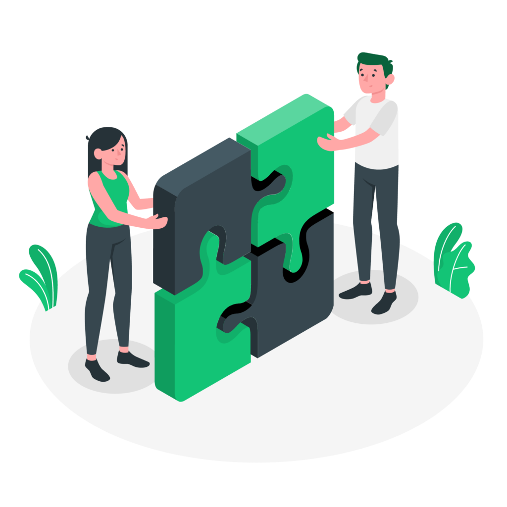
In addition to The Blueprint, I’ve developed the tools below over many years to help clients prepare for their website project. On the left, “The Big Three” is a way of understanding how the different components of website design and development fit together. And on the right, we have a set of questions that will help clarify the goals and outcomes for the project. Simply put, the more thought that you are able to devote to these questions ahead of time, the better the end result will be. Questions? Comments? Please contact me!
The Big Three
1) Content
What is your new site going to say? What topics will you cover, and how do you want to see it organized?
In my experience, organizing the site’s content can be one of the most challenging parts of the whole project – especially for clients. One of the keys is to anticipate where new content will live, whether it’s updates about the organization, news items, new program pages, upcoming events, etc. While this part can be a challenge, I will guide you through the process and consult with you to help get the right structure. And your new website will be flexible and easy to update, so that you can change menu items and add new pages and articles easily.
2) Function
What is your new site going to do? For example, will you be signing people up to your email list? Using the site to connect with social media? Collecting donations? Publicizing events? Selling items online? All of this functionality and much more can go into the project, and it’s helpful to outline everything at the beginning.
3) Design
What is your new site going to look like? How will it feel to navigate around? Do you already have a logo? A color scheme? Are you looking for gravitas or a lighter touch?
10 Before-We-Begin Questions
These questions are a great place for your new project to start. You can make sure that you’re on the right track by addressing this list before we even set up a meeting. Download now.
- Why do you want a new website right now?
- How would you define a successful outcome? In other words, what does a “win” look like?
- Who are the main audience(s) for your website? You cannot say “the general public” → instead, be specific!
- What do you like the least about your current website?
- What do you like the most about your current website?
- Find three other great websites and write down what you like most about them.
- What are the most important pieces of content that will go on your website? In other words, what information is most important to your visitors?
- What do you need your new website to do? IE Functionality. Forms, RSVP’s, deliver timely information, etc etc
- What are 3-5 words or phrases that you want to describe the design (or “look and feel”) of your new website? And how are these words or phrases connected to your organization?
- What design materials do you already have in place (logo, color scheme, font choices, key photos, printed materials, etc.)?
- BONUS: How does your organization use social media?
Frequently Asked Questions
Before launching Tomatillo Design, I spent my entire career in the nonprofit world. These days, I work most often with small-to-medium-sized nonprofits, whether they are all-volunteer operations or have a handful of staff members. Just over the last year, for example, I’ve worked with a statewide association, a major university, several different advocacy organizations, individual consultants, and many more. Whatever the size and shape of your organization, I’d love to learn more about what you need and how I can help. Check out my portfolio to see an overview of my clients from the past few years.
Yes – it’s just me! I have purposefully kept my business focused so that I can provide the best possible experience for my clients. I do all of the website design, development and support myself. This approach yields two powerful benefits for clients. First, this helps me keep costs low; many of my clients could not have afforded the higher prices of larger agencies and marketing firms. Second, my approach means that clients are always interacting directly with me. No one is ever handed off or put on hold with third-party customer support. When I work with a client, they know who they will be interacting with for the duration of the project.
When we build a brand-new website for your organization, my work doesn’t stop on the day we launch. Instead, I always provide plenty of training so that you and your team are comfortable making edits and posting new content directly to your site. Live virtual trainings can easily be recorded and distributed within your organization as new staff come on board. In addition, I love getting follow up questions and answering back with screenshots and short videos. The goal of all this training is to empower you to own your website, to keep it up-to-date, and to maximize its effectiveness over the long haul.
My projects always include support for 6-12 months from the date of launch, and then after that, if you’d like to keep me on as your “website guy,” you can get one of my Website Care Plans. These flexible plans are totally optional; many clients find that they would like for me to continue hosting and supporting their site for years to come.
Less is more; simpler is better.
A well-constructed website highlights the most important information and reduces clutter. I help review content and make suggestions about how to streamline individual pages, main menu items, and more.
Emphasize readability, white space, and beautiful typography.
My designs prioritize simplicity and readability over designs that require more work from visitors. I use eye-catching techniques, such as full-bleed background photos, where appropriate.
Great design interfaces can make complex information easy to skim.
Visitors find what they need, quickly and easily. For example, I include an easy site search that presents results in a logical, clear way. I also use design techniques like multi-column menus and tabs on pages to help visitors see and interpret the most important information at a glance.
Mobile is not an afterthought.
All of my websites are made for use on mobile devices and feature responsive design so that your content will always look great.
A successful project transforms the website into a hardworking “employee.”
Your website should work for you; like a great staff member, it answers visitors’ questions, directs them to where they need to go, and allows them to do what they need to do. A successful project lasts for years and saves hundreds of hours for the organization.
Great question! I have a page that outlines the process of building a new website together in collaboration – click here to learn more.

